Showing posts with label Research and Planning. Show all posts
Wednesday, 28 March 2012
Audience Research on my Ancillary Task
Audience Research Results
These are the results of my audience research:
- What do you think of my colour scheme? All of the responses said that it was either good or very good, so i will keep them the same.
- What do you think of the fonts i used? Everybody said that my fonts were good, so i won't need to change them as they are relevant for my target audience.
- What do you think of the layout? The response i received said that my layout was good for the audience and that i don't need to change it.
- What do you think of the images i have used? The responses told me that the images were very good and that they were relevant for the audience.
- Do you think the language is appropriate for my target audience? All said that the language was good, therefore i don't need to change.
- What do you think is the strongest part of my ancillary task? This was an open question. People said that the colour scheme and the images was the best part.
- What do you think i could make improvements on? People said that the font needed some work, so i will have to make some changes to that, so that it appeals to the target audience.
Thursday, 22 March 2012
Ancillary Task Survey
Create your free online surveys with SurveyMonkey, the world's leading questionnaire tool.
Tuesday, 20 March 2012
Friday, 16 March 2012
Institutions of Drake and Josh
A similar product to mine is 'Drake and Josh', this is produced by Schneider's Bakery and Nickelodeon Productions.
Schneider's Bakery Productions, Inc. is a television production company founded by Dan Schneider.
They also produce programmes such as 'iCarly' and 'Zoey 101' which also has the same target audience as my audience. However, this production compary 'DanWarp' only made the first 60 episodes then it continued to Nickelodeon Productions.
Nickelodeon, is an American children's channel owned by Viacom and operated under its Nickelodeon Kids and Family Group. The channel is primarily aimed at children in grade school and early teens, Nickelodeon has been run by Cyma Zarghami.
National Amusements, Inc., is a world leader in the motion picture exhibition industry operating more than 950 movie screens in the U.S., U.K., and Latin America. National Amusements delivers entertainment in theatres around the world under its Showcase, Multiplex, and Cinema de Lux brands.
Based in Norwood, Massachusetts, National Amusements is a closely held company operating under the third generation of leadership by the Redstone family. National Amusements is also an equal partner in the online ticketing service, MovieTickets.com, and is the parent company of both Viacom and CBS Corporation.
Schneider's Bakery Productions, Inc. is a television production company founded by Dan Schneider.
They also produce programmes such as 'iCarly' and 'Zoey 101' which also has the same target audience as my audience. However, this production compary 'DanWarp' only made the first 60 episodes then it continued to Nickelodeon Productions.
Nickelodeon, is an American children's channel owned by Viacom and operated under its Nickelodeon Kids and Family Group. The channel is primarily aimed at children in grade school and early teens, Nickelodeon has been run by Cyma Zarghami.
Viacom is a leading global entertainment content company, they deliver across the globe through television, motion pictures and a wide range of digital media. Media networks assoicated with them include BET, MTV, VH1, Nickelodeon, Nick at Nite, COMEDY CENTRAL, Centric, CMT, Spike, TV Land, Logo and more than 160 networks around the world. In addition, digital assets such as Neopets, Addicting Games, BET.com and Quizilla offer compelling and interactive content.
Paramount Pictures Corporation offers audiences access to a huge library of top films through brands like Paramount Pictures, Paramount Vantage, MTV Films, Nickelodeon Movies and Paramount Home Entertainment. Fueled by their brands, Viacom serves an ever-growing population of kids, tweens, teens and adults. National Amusements Inc is the parent company of Viacom.
National Amusements, Inc., is a world leader in the motion picture exhibition industry operating more than 950 movie screens in the U.S., U.K., and Latin America. National Amusements delivers entertainment in theatres around the world under its Showcase, Multiplex, and Cinema de Lux brands.
Based in Norwood, Massachusetts, National Amusements is a closely held company operating under the third generation of leadership by the Redstone family. National Amusements is also an equal partner in the online ticketing service, MovieTickets.com, and is the parent company of both Viacom and CBS Corporation.
Thursday, 8 March 2012
Tuesday, 6 March 2012
Tuesday, 28 February 2012
Friday, 6 January 2012
The Pitch
Conventions of a child's television programme
The conventions of a children's television program is that the characters are all young teens aged around 9-16. This is so the audience can relate to the characters easier. Another convention of a children's television program is the settings. They tend to be set at the family home and at school, this is so the audience can relate to the characters easier as most children go to school. A convention of a children's television programmes theme tune is having an upbeat theme song with fast paced editing to make the overall opening sequence energetic. It is also conventional to use bright colours throughout the show with high key lighting to make the setting bright and to give the scene more realism as they are most likely at school or at home where it is bright. It is also conventional in a childrens television program to over exaggerate stereotypes, we will use this in our filming as we will be using the very stereotypical characters such as a geek which will be wearing a shirt with trousers and trying to look very smart and formal, they will also be wearing very dull colours and very simple colours such as grey and beige. We will also be using a sporty boy aswell who will be very stereotypical as he will be wearing trackies and a hoody to emphasise this. As well as these we will also be using a popular boy and a popular girl who will be in a relationship and the rest of the school envies them. Since the program is based in a a school we will also be using a teacher as one of the main characters who will be a popular teacher who the students get along with.
Conventions of a children's magazine
There are many conventions to a children's magazine. One of these is having bright colours for the images and the masthead and the cover lines to make the whole page stand out from the rest of the magazines on the magazine stand in the shop. We will be using colours such as yellow, blue and pink to match the characters personalities with the popular boy and girl being the main characters. Another convention of a children's magazine is having the main character of a popular children's television program. This is so that if someone is a regular viewer of the show then they will recognise them as then want to see what the story is about them and the program. Another convention of a children's magazine is having cover lines relating to the main image on the front page with some others relating to the main content in the magazine. On the cover of the magazine we will have a group picture of the five main characters. We will also use composition with the popular boy and girl in the middle with the sporty boy next to them with a football and the teacher the other side looking formal with the geek holding books and being separate from the others. We have chosen this because of our audience research we done. The information we gathered was that books and glasses are associated with geeks and nerds and so to make the character's personalities recognisable we associated them with the character. The same with the sporty boy and the football.
Conventions of a children's DVD cover
A convention of a children's DVD cover is having bright colours all over the page with having the background an image of the main character with the other main characters around them. We will also be using the same colour scheme as on the magazine as they match the characters and there personalities. It is very conventional to have a very bright masthead on the DVD cover so it stand out and so if someone watch's the program they will be able to recognise it and is more likely to buy it. This is the same reason why they have the main character on the front as if you recognise them there is a higher chance of you buying the DVD. Another convention of a DVD cover is having the slogan at the bottom of the cover, this is to attract children who don't watch the program to get into it and to buy the DVD.
What we have found out from our target audience
From our target audience research we found out many different things such as what specific age to target and how to target them with the use of colour and images. The colours we have found out attracts the children's audience are bright colours such as blue and yellow as these stand out. We found out what specific things do people expect to see in an opening sequence to a child's television program, we found out that most people expect to see clips of the main characters in during the show. We will use this during our finished product as we will also include clips of the main characters during the opening sequence. This helps during the show as it makes them more recognisable as the main characters. We also found out that its the narrative of the program that attracts people to a children's television program, we will use this information we got from the research by focusing on the narrative more than other aspects of the filming process.
The conventions of a children's television program is that the characters are all young teens aged around 9-16. This is so the audience can relate to the characters easier. Another convention of a children's television program is the settings. They tend to be set at the family home and at school, this is so the audience can relate to the characters easier as most children go to school. A convention of a children's television programmes theme tune is having an upbeat theme song with fast paced editing to make the overall opening sequence energetic. It is also conventional to use bright colours throughout the show with high key lighting to make the setting bright and to give the scene more realism as they are most likely at school or at home where it is bright. It is also conventional in a childrens television program to over exaggerate stereotypes, we will use this in our filming as we will be using the very stereotypical characters such as a geek which will be wearing a shirt with trousers and trying to look very smart and formal, they will also be wearing very dull colours and very simple colours such as grey and beige. We will also be using a sporty boy aswell who will be very stereotypical as he will be wearing trackies and a hoody to emphasise this. As well as these we will also be using a popular boy and a popular girl who will be in a relationship and the rest of the school envies them. Since the program is based in a a school we will also be using a teacher as one of the main characters who will be a popular teacher who the students get along with.
Conventions of a children's magazine
There are many conventions to a children's magazine. One of these is having bright colours for the images and the masthead and the cover lines to make the whole page stand out from the rest of the magazines on the magazine stand in the shop. We will be using colours such as yellow, blue and pink to match the characters personalities with the popular boy and girl being the main characters. Another convention of a children's magazine is having the main character of a popular children's television program. This is so that if someone is a regular viewer of the show then they will recognise them as then want to see what the story is about them and the program. Another convention of a children's magazine is having cover lines relating to the main image on the front page with some others relating to the main content in the magazine. On the cover of the magazine we will have a group picture of the five main characters. We will also use composition with the popular boy and girl in the middle with the sporty boy next to them with a football and the teacher the other side looking formal with the geek holding books and being separate from the others. We have chosen this because of our audience research we done. The information we gathered was that books and glasses are associated with geeks and nerds and so to make the character's personalities recognisable we associated them with the character. The same with the sporty boy and the football.
Conventions of a children's DVD cover
A convention of a children's DVD cover is having bright colours all over the page with having the background an image of the main character with the other main characters around them. We will also be using the same colour scheme as on the magazine as they match the characters and there personalities. It is very conventional to have a very bright masthead on the DVD cover so it stand out and so if someone watch's the program they will be able to recognise it and is more likely to buy it. This is the same reason why they have the main character on the front as if you recognise them there is a higher chance of you buying the DVD. Another convention of a DVD cover is having the slogan at the bottom of the cover, this is to attract children who don't watch the program to get into it and to buy the DVD.
What we have found out from our target audience
From our target audience research we found out many different things such as what specific age to target and how to target them with the use of colour and images. The colours we have found out attracts the children's audience are bright colours such as blue and yellow as these stand out. We found out what specific things do people expect to see in an opening sequence to a child's television program, we found out that most people expect to see clips of the main characters in during the show. We will use this during our finished product as we will also include clips of the main characters during the opening sequence. This helps during the show as it makes them more recognisable as the main characters. We also found out that its the narrative of the program that attracts people to a children's television program, we will use this information we got from the research by focusing on the narrative more than other aspects of the filming process.
Friday, 16 December 2011
Risk Assessment
School corridor - Make sure the area is clear and safe and that we film while other students are in lesson and the corridor is empty.
School classroom - Make sure that the areas are clear and everthing is out of the way of the filming.
Front of school - If it is wet when filming, make sure that we are careful while running and make sure the road is clear when filming.
School classroom - Make sure that the areas are clear and everthing is out of the way of the filming.
Front of school - If it is wet when filming, make sure that we are careful while running and make sure the road is clear when filming.
Thursday, 15 December 2011
Outline of audio visual media
Characters:-
Nerd - glasses, tie up, girl, carry books
Sporty - boy, hoodie, trackies
Popular Girl - pretty, tie down, dating popular boy
Popular Boy - hansome, buttons up done, dating popular girl
Teacher - friendly, helpful
Setting:- School to make it relatable
Music:- upbeat to show light hearted
Plot:- Our opening, go through each of the characters and zoom in then pause on them doing their stereotypical things for example, the geek reading, the sporty boy playing football, the popular girl blows a kiss to the popular boy, as they are all going to the classroom, then sit down and that it pans to the teacher and the opening finishes.
Shot list of audio visual media
1. edited screen: title of show
2. long/mid shot: nerd walking into school, hugging her folders, alone 'pause' then nerds name comes up
3. pans to a long shot tracking: sporty boy kicking his football along the corridor 'pause' then sporty boys name comes up
4. leads to mid/close up: popular girl blowing a kiss 'pause' then popular girls name comes up
5. cuts to mid shot: popular boy catches the kiss 'pause' then popular boys name comes up and meets up with sporty boy to walk into the classroom
6. wide shot: of all the 4 walking into the classroom
7. tracks them in for them all the sit down
8. pans around to the teacher next to the white board 'pause' teachers name appears
9. editing in the title of the show and a still picture of all the characters
10. fades out
2. long/mid shot: nerd walking into school, hugging her folders, alone 'pause' then nerds name comes up
3. pans to a long shot tracking: sporty boy kicking his football along the corridor 'pause' then sporty boys name comes up
4. leads to mid/close up: popular girl blowing a kiss 'pause' then popular girls name comes up
5. cuts to mid shot: popular boy catches the kiss 'pause' then popular boys name comes up and meets up with sporty boy to walk into the classroom
6. wide shot: of all the 4 walking into the classroom
7. tracks them in for them all the sit down
8. pans around to the teacher next to the white board 'pause' teachers name appears
9. editing in the title of the show and a still picture of all the characters
10. fades out
Production Plan
January - filming
- Front of school
- Folder, Pen, Ruck Sack. (nerd)
- Tie, trousers, shirt, blazer, clumpy shoes.
- Video camera
- Corridor
- Football (sporty)
- sporting attire
- Video camera
- Corridor
- mobile phone, iPod (popular boy and girl)
- tie low, rebellious school uniform
- video camera
- Corridor, classroom.
- folder, pen, ruck sack, football, phone, iPod
- popular boy and girl costume, sporty boy costume, nerdy girl costume
- video camera
- classroom
- whiteboard, pen, stationary
- teacher clothing (teacher)
- video camera
- classroom
- each character's equipment
- each character's costume
- video camera
- Front of school
- Folder, Pen, Ruck Sack. (nerd)
- Tie, trousers, shirt, blazer, clumpy shoes.
- Video camera
- Corridor
- Football (sporty)
- sporting attire
- Video camera
- Corridor
- mobile phone, iPod (popular boy and girl)
- tie low, rebellious school uniform
- video camera
- Corridor, classroom.
- folder, pen, ruck sack, football, phone, iPod
- popular boy and girl costume, sporty boy costume, nerdy girl costume
- video camera
- classroom
- whiteboard, pen, stationary
- teacher clothing (teacher)
- video camera
- classroom
- each character's equipment
- each character's costume
- video camera
Focus Group
For my focus group I used a group of children aged between 11 and 15, as from my questionnaire I learnt that these are the age group of children that watch childrens television drama.I showed them the opening sequences that I have analysed and asked them what they thought of them.
Drake and Josh
I then explained my ideas for my opening sequence and they gave me feedback on what they liked and disliked. Here is what i found:
Drake and Josh
- 100% thought that the opening sequence could be shorter
- 85% thought that characters were introduced well
- 40% said that the colour was very good and representational
- 60% likes that the logo was shown at the start of the opening sequence
- 100% liked the editing on the open sequence
- 95% liked the theme tune and the lyrics that go with it as they thought that the lyrics were very fitting for the programme and the backing track was upbeat and fun
- 75% thought it was good that the cast included boys and girls
- 100% said they liked that each character was introduced individually
- 60% thought that the editing of this opening seuquence was too fast paced
- 100% liked that the logo of the programme was clearly shown at the end of the clip
- Only 35% liked the chequered effect of the special effects behind the actors names as they appeared on the screen
- 80% thought it was good that a few of the main characters were introduced in the opening
I then explained my ideas for my opening sequence and they gave me feedback on what they liked and disliked. Here is what i found:
- They all liked the idea of introducing each character as an indivdual, in sepearte scenes
- They don't think it should be too long
- They liked the idea of having a fun, upbeat theme tune
- They said my first ideas were good
Tuesday, 13 December 2011
Questionnaire responses
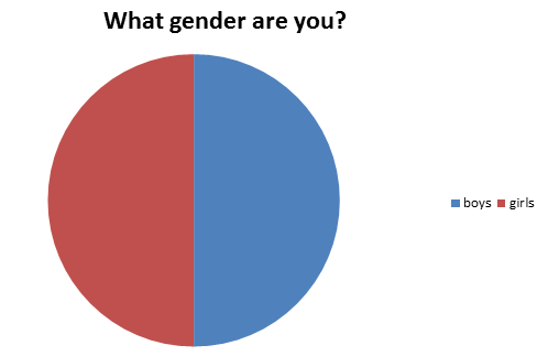
From my questionnaire and the responses i received, i found that the majority of people that watch children's television programmes:
- are both girls and boys, equally.
- are around the ages of 11 to 15 years old.
- either every week or every day
- are interested in the characters in the shows
Thursday, 27 October 2011
Tracy Beaker magazine
This magazine is aimed at a younger female audience compared to the other magazines. This is made clear by the young girl on the front. There are lots of subtitles and bubble writing over the cover, which helps to show they are aiming at a younger audience. The route of the eye travels over the main headline and down across the subheadings at the bottom. The hot spots are placed on the face of Tracy which will be instantly recognised by the target audience, one on the title, which again would make the the audience recognise what the magazine is and on the subheadings which would attract the target audience to what is inside the magazine. Tracy's pose looks very cheeky and mischievous, again attracting the target audience to find out about her and what's inside the magazine. The illustrated Tracy on the left shows the aim towards a young target audience through the direct speech to the audience, making them feel related to the magazine.
The writing is very bold and bubbly, which appeals to audience and the writing is mainly in capital letters. Phrases such as "FAB" and "WICKED" are examples of this, and this would appeal to the younger audience, making them want to purchase the product. The colours are all kept within the same colours as the heading. This makes it very recognisable for the regular viewers of the programme.
Subscribe to:
Posts (Atom)